The first step to understanding more about your project is to collect data in a consistent way. If you’re already a PlanRadar user, you’re well on your way to achieving that goal. But how can you access that information in a way that helps you to make better decisions? We’ve recently updated the way that PlanRadar users view project statistics. It makes it easier to see where you’re making good progress or where problems are building up.
Custom boards for custom statistics
The first thing that has changed is that you’re no longer tied to a single, static statistics board. Now you can make as many boards as you like, with each displaying up to 8 different charts or graphs.
Maybe you want a board that’s exclusively dedicated to your electricians or plumbers. Maybe you want one board where you can see all overdue tickets, broken down in different ways. Perhaps you’re monitoring all tasks that have a deadline in the next week to see whose responsibility they are.
Whatever your project is, you can create a custom statistics board that fits your needs.
Due date monitoring
In this example, our site manager wants one statistics board where he can see all tickets that are due in the coming week and month. He also wants a board where he can see tickets that are overdue and who they belong to. That way he can see where he needs to intervene.

In the first board, he includes charts that show the tickets due in the next week and in the next month. He can also separate these by assignee or by status. If there are a lot of tickets due in the next week but they haven’t been marked as “in progress” yet, he now knows to follow up with the contractors responsible to make sure that they are aware of their deadlines.
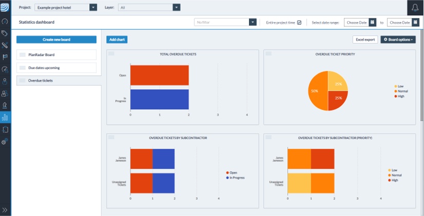
For the board showing overdue tasks, one chart shows the total number of overdue tickets. Another shows which of these overdue tickets was assigned a low, medium or high priority. This makes it clear how many urgent tasks have been overlooked. He can also create a chart that splits the overdue tickets out according to their status. The tickets that are already in progress might only need short extensions. Meanwhile, tasks that haven’t been started yet might be overdue for other reasons. That could include a delay by another contractor whose work needs to be finished before the next step can start.
Finally, he can create a chart that splits out the overdue tickets according to the assignee. That way, it’s easy to see if one person is responsible for more than their fair share of overdue tickets. They might need more resources or the tickets could be reassigned to somebody who is less busy.
Resource management
In this example, our project manager wants to know whether her team are able to get all their tasks done.
In the first chart, she can see the number of tasks assigned to each subcontractor or team member. That way she can tell who has the most work, overall.

In the second chart, she uses a stacked bar chart to see how each team member’s tickets break down by status. That way she can compare who has the most open and in-progress tasks. It could also reveal who has the spare capacity to take on new jobs.
For this project manager, a single chart tracking overdue tasks by assignee will also be useful, as it shows the individuals under pressure. It may also show where she might need to add to her workforce. If a plumber, for example, isn’t able to manage all of a project’s plumbing tasks, she might consider taking on an additional subcontractor either temporarily or permanently.
Alternatively, if the project manager is managing different subcontractors on different projects, she can view the same boards without filtering by project. Then she can see if a subcontractor on a different project has more capacity. They could be moved over to solve the resource issue.
Follow up on interventions
In this case, an expert in site safety wants to create a board that tracks all of their health & safety interventions.
First, they create a pie chart that shows the total number of safety-related tickets they’ve made.
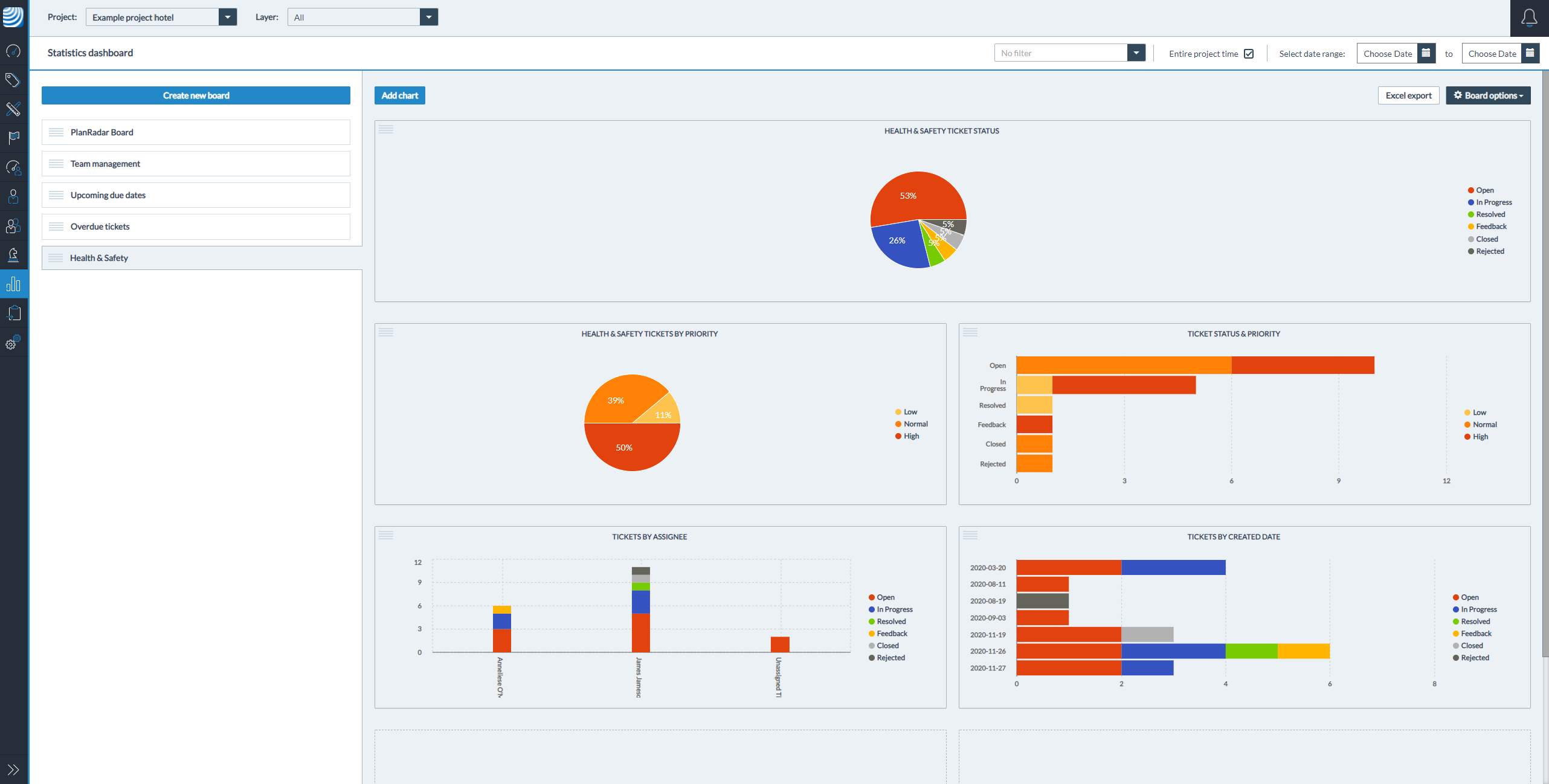
Then, they create a pie chart that groups these tickets by priority. Now they can see how many urgent issues they’ve noted, versus more trivial problems.
If they want to see how many high priority issues still need resolutions, they can create a chart that groups all tasks by their status and priority. That way they can see how many unresolved major and minor issues there are.
If it’s important to see which tasks were created on a particular date – for example, on the last date that they completed a site safety audit – then you can tally tickets according to the date created and their status. The QHSE manager can then see whether their recommendations from an inspection have been acted on.
Custom statistics: tailor-made oversight for your projects
The new PlanRadar statistics page enables users to combine their existing filters for organising tickets to view the most relevant statistics for them.
Whether your filters are for due dates, issue types, priority levels or any other kind of category, you can now visualise that data clearly without needing to run an Excel report for analysis. With swift oversight on issues, you can make informed decisions with greater efficiency.
Try PlanRadar free for 30 days to see how the new statistics feature could give you extra insight into your projects.


